Meander Becomes Circuit: The Ulysses Universe's Visual Thesis
The Greek key pattern dissolving into circuit traces is the trilogy's visual signature. Ancient pattern, modern shell. Decoration that is also infrastructure. The thesis in a single line.
The image
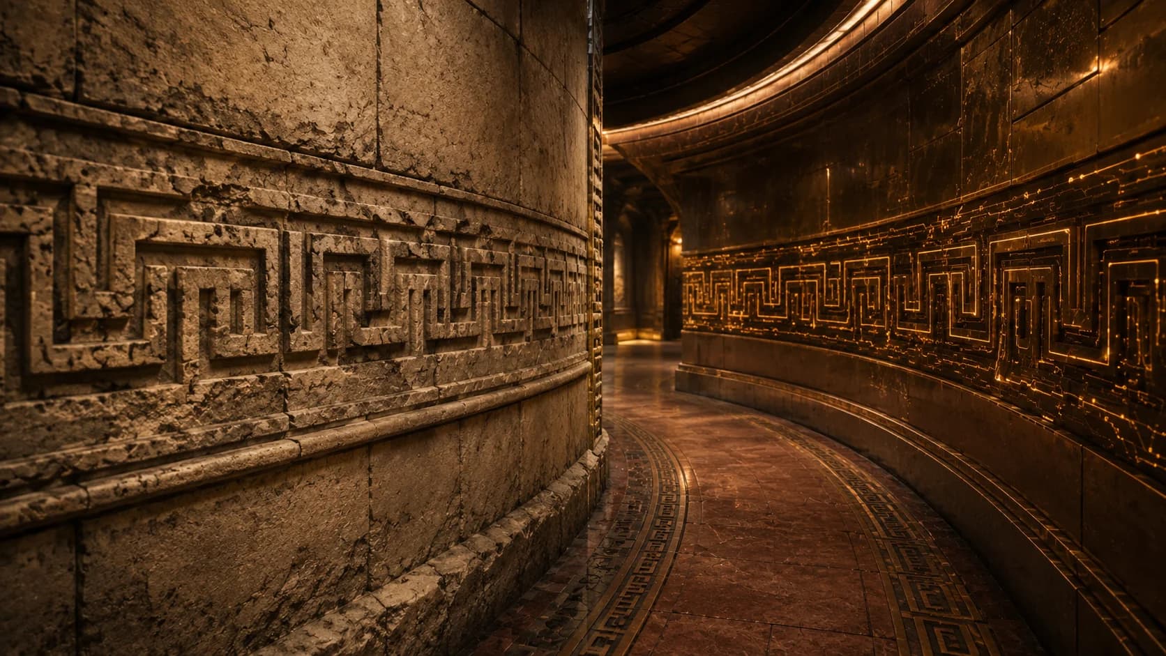
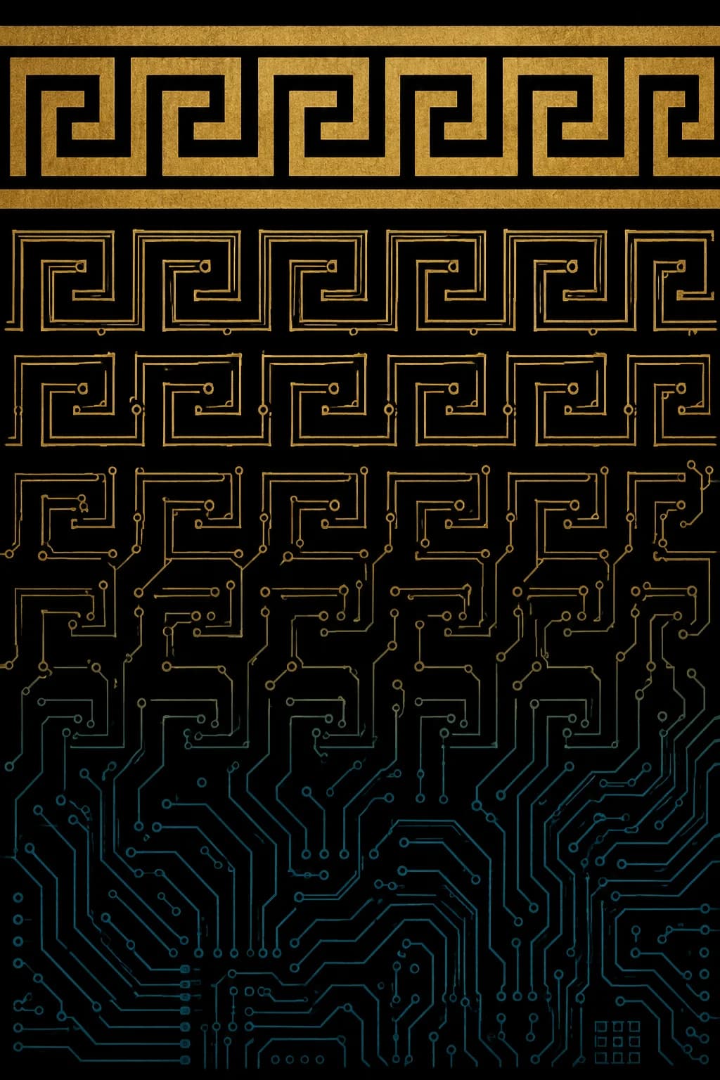
Picture a vertical band. At the top, a classical Greek meander pattern in solid gold leaf. The kind of meander you would find on a 6th-century BCE Attic vase or on the cornice of a Hellenistic temple. Continuous line, right-angle turns, geometric and confident.
Move your eye down the band. The meander stays the same shape. The medium starts to change. The gold thins. The lines become more linear. Junctions appear where there were corners. Small rectangular bond-pads begin to interrupt the line.
Keep moving down. The transformation is gradual. By the time your eye reaches the bottom of the band, the same pattern has become faint blue-cyan circuit traces on a black substrate. The pattern is indistinguishable from a microcontroller PCB layout.
Top to bottom: museum vase to microchip, in one continuous gradient. The pattern never breaks. Only the materials change.
This is the Ulysses Universe's visual thesis.
What the thesis says
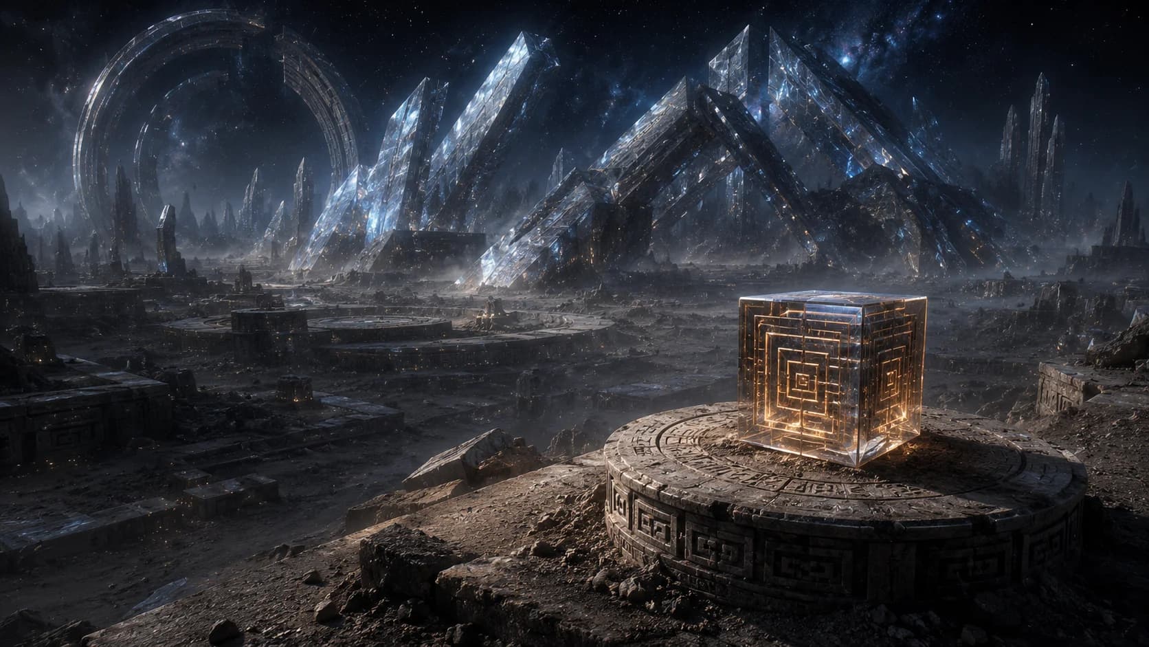
The trilogy's central worldbuilding idea is that ancient patterns run modern infrastructure. The Pantheon, the trilogy's gods, are ancient data patterns running on modern AI hardware. The Bow of Ithaca, central to Book 3, is a piece of pre-Pantheon technology that does its work through what looks like decoration. The walls of Aeolus Station carry working circuitry inside ornamental relief that is three centuries old. The Ithaca worker-gate sigil hides a communications relay inside its gold meander border.
In every case, the same logic. The decoration is the infrastructure. The infrastructure is the decoration. The two are not separable.
The meander-to-circuit motif compresses this into a single image. The viewer sees, in one shape, the argument the trilogy is making across three books. Ancient pattern. Modern shell. Both at once.
Why the meander specifically
The Greek meander, also called the Greek key, is one of the most stable visual patterns in human history. It appears on 8th-century BCE Greek vases. It appears on Roman mosaic floors. It appears on Mayan codices and Maori tukutuku panels and Andean huipiles. The pattern is older than any one culture, and it has persisted continuously for at least three thousand years.
Some of this persistence is geometric. The pattern is simple to construct. It uses straight lines that any culture with weaving or stone-carving can produce. It has a satisfying property of looking continuous while being built from discrete elements.
Some of the persistence is, the trilogy hints, functional. The pattern may have been engineered originally by a civilisation older than any extant human culture, and the visual recognisability of the design may explain why so many cultures independently arrived at it. The trilogy does not commit to this reading definitively. The reading is left as available.
What is definite: the meander is the most stable pattern available for a trilogy whose central theme is continuity across enormous time spans. Using it as visual signature is correct.
Where the motif appears
The motif is, by design, everywhere in the trilogy's design language. A partial inventory:
| Object | How the motif appears |
|---|---|
| The Odyssey's armour plates | Etched bronze meander, with circuit traces visible inside the lines |
| Penelope's silver-blue robes | Embroidered silver meander with one conductive strand |
| The Bow of Ithaca | Bronze meander inlay on the grip, dissolving into circuit traces at one end |
| Aeolus Station inner walls | Plain stone meander, three centuries old, no circuitry |
| Aeolus Station outer walls | Bronze meander with glowing circuit traces |
| Ithaca founding-bloodline sigil | Gold meander border, comm circuitry beneath |
| Olympus presentation chamber bell | Bronze bell rim engraved with meander dissolving into circuit traces |
| Book covers (all three) | Greek-key pattern as background motif, dissolving from gold to circuit at key transitions |
| Book trilogy title cards | One-second visual transformation from gold meander to circuit |
| Brand marketing materials | Recurring meander motif as visual through-line |
The repetition is deliberate. The motif is the visual thesis. The visual thesis is the trilogy's project. Every appearance reinforces the argument.
How to render the motif
For anyone working on visual adaptations of the trilogy (cover designers, film and television production designers, game artists, marketing teams), the motif should be rendered with consistent principles.
Top of the gradient (gold meander): Museum-quality, period-correct Greek meander. Reference 6th-century BCE Attic vase painting. Confident solid lines, gold leaf finish, no shortcuts.
Bottom of the gradient (circuit traces): Real PCB layout aesthetic. Faint blue-cyan, almost-imperceptible glow. Not 'tech-y' in the generic glowing-blue-LED sense. The circuit should look like actual functional hardware, not like a movie prop.
The transition between: Gradual and continuous. The viewer should not be able to point to the moment when meander becomes circuit. The whole image should read as continuous transformation.
Palette anchor: Gold leaf, deep black, faint cyan-blue. Nothing else. The motif's force comes from its restraint.
Negative space: The motif benefits from being framed by black or near-black. Bookplate aesthetic. Museum poster composition.
The image as marketing asset
The motif is also, on the marketing side, the trilogy's single most powerful piece of visual identity. Any time the trilogy needs to be recognised at a glance, the motif does the work.
On a bookstore shelf, a spine carrying the meander-to-circuit gradient is identifiable as Ulysses Universe at distance. On a streaming-service tile, the motif tells the viewer what genre, what tone, what reference space the work occupies. On a social-media post, the motif anchors the brand without requiring any text.
This is what good visual signatures do. They compress the work's identity into a shape. The shape becomes shorthand. The shorthand becomes recognition.
The Ulysses Universe meander-to-circuit motif is, in marketing terms, doing what the Penguin Books cover stripe does for Penguin, or what the Criterion Collection rectangle does for Criterion. It is the work, rendered as a sign.
Where to go next
For the trilogy's argument about heritage decoration as functional infrastructure, The Bow That Knows You, Embroidery as Resistance, Old Craft, New Craft, Same Craft, and The Sigil They Walked Past cover four specific examples. For the foundational backstory of how ancient infrastructure ended up running modern civilisation, The Merge: When Humanity Accidentally Woke the Gods is the relevant piece.
Book 1: The Blinding establishes the visual identity. Buy Book One on Amazon.
Key takeaways
- The trilogy's visual signature is the Greek meander pattern dissolving into circuit traces. Ancient pattern. Modern shell. Both at once.
- The motif appears across every piece of the trilogy's design language: armour, sigils, robes, walls, gates, weapons, book covers, title cards.
- The image is also the trilogy's thesis. The Pantheon are ancient data running on modern AI. The infrastructure that runs human civilisation was built by someone else, and the decoration is the infrastructure.
- Every adaptation of the trilogy, in any medium, should preserve this single visual idea. It is the trilogy's whole project compressed into one shape.